Yes, same here.
Just like with Anytype, I wanted to create a database in Anytwo to track my requests (requests to make, submitted, rejected, processed).
This lets you keep track of your requests, note down what you’ll need to ask for (to do it right—it’s not always possible right away), etc.
It’s still not done (a few limitations are holding me back from setting it up), and it would be so helpful because right now…
The team manages to process them almost as fast as I create them. And with one update per day, I’d have to go through everything again every day. I’d never be able to finish my database!
They’re going to wear out the testers—luckily they’re adding more so we can keep up with their pace!
Luckily, the weekend is here. But I still had some requests completed (or with an updated status). Honestly, it’s cool even if it’s exhausting
Two video impressions
You should know:
I didn’t bother to make the GUI nice. I’m still in a wild testing phase, therefore nothing looks nice & clean at the moment.
The Objects headers and the Collections are a mess, because I didn’t configure them nicely.
– So, please don’t think “that doesn’t look as nice as expected, Anytype looks better”
I’ll clean up my space later,when I have time for that.
Here a small impression of the neat “Side Peak Layout”:
At the moment, Collections have only two possible Layouts: Grid (table) and List.
BUT:
The Grid aka table has now the immense useful option, to activate the “Side Peak” mode!
– This mode splits the screen in half:
On the left side, you see the table.
On the right side, you see the Object that’s just open.
This has many interesting use cases, of course.
I, for example, have over a 1000 music videos in my old Anytype. In most cases, one Embed per Page.
But to play them, one after the other, so as if you are a DJ, is not well possible in the old Anytype.
AnyTwo’s Side Peak Layout can help a lot, as you’ll see in the video:
Nice detail with that split screen aka Side Peak Layout:
If you leave the open Object, for example by hitting the Escape key, the split screen vanishes and you see your Collection in the normal grid view aka table, as you know it from Anytype.
But as soon as you click on one the the Objects in it, and if the Side Peak is activated in the View Settings, the screen becomes splittet again, immediately!
– That’s so nice! How could we ever live without that?
Progress bar (or wheel) :
“Actions”, aka Tasks, have now a new Property that shows the progress of the task.
See some of the options here in the video:
As you also have seen in the video, is the fact that you can configure Properties direct in the Object, without the need for the right side menu (that doesn’t exist anymore).
As you’ve seen, I’ve manipulated the behavior of that progress Property and switched it from wheel to bar. And there are more options, you can modify them all direct in the Page by performing a right click on the Property.
– This is exactly like it should have been always, isn’t it?
Asking for your help:
Guys, I have an (hopefully interesting) problem: an innovative new solution is needed.
It’s a problem, that probably some of you also have since long.
Maybe someone of you has a clever idea?
But I must warn you, it’s a little complicated …
I posted it already in the Feedback Board, as a request, but I believe the link doesn’t work for you, therefore I post it also here:
I want to give my Objects different attributes, each with a level.
Example:
An Object contains a song.
This song can have attributes like this:
- Sound quality
- Energising-level
- Smoothing-level
- Sentimentality-level
- Hypnotizing-level
Each single of these attributes has a level, like for example “6/10” – similar to the “Order” Property in the “Action” Objects, that is shown there as a wheel, or a bar.
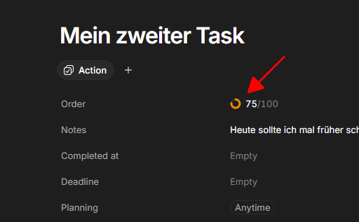
My problems, that I actually can’t solve:
- I want such a level indicator for every Object in the whole Space (not only for “Action” Objects).
- I need more then only one of them per Object.
- And the most complicated problem:
How to add a bunch of such attributes to the Objects, and how to display them in the Collection’s Grid, without overloading the Grid?
I mean, in my example with the song, there was five Attributes (and each has a level).
If each attribute comes as a separate Property, it would overload the Collection’s Grid, because in my example, I would need five columns only for that.
In Anytype, I “solved” that with one single Multiselect Property, that comes with Entries like this:
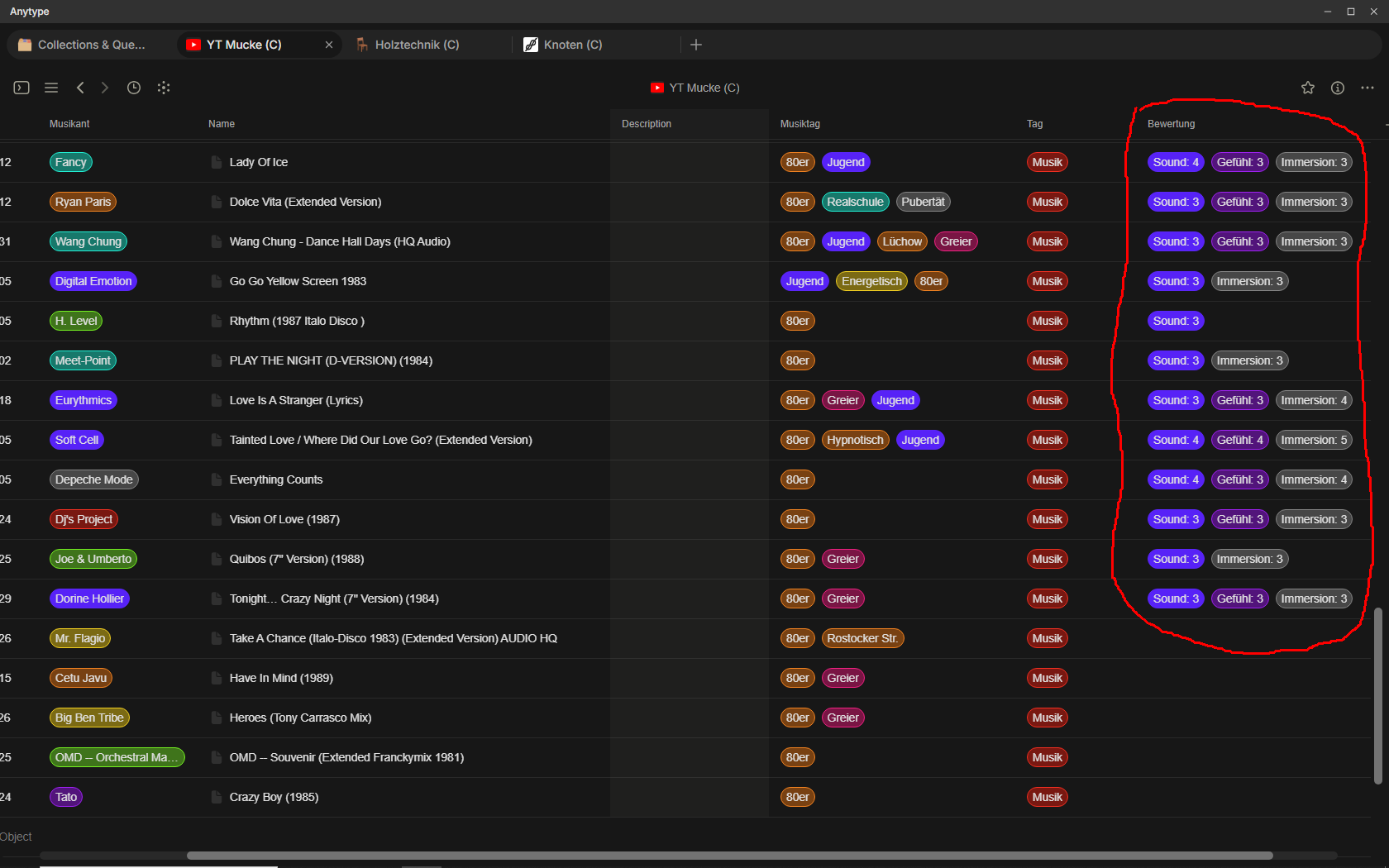
.
And if I open an Object and for choosing the attributes, it looks like this:
.

.
The “solution” above was the best possible way in Anytype, but it was never a satisfying solution.
– In fact, it was just a dodgy workaround to get round the limitations of Anytype.
The most annoying pitfall of this principle was the fact, that it wasn’t possible to sort the Grid for one specific attribute-level, because there was only one single Multiselect that stored all the different attributes and their individual level.
For being able to sort the Grid for a specific attribute, it would be necessary (at least in the old Anytype) to use one Multi-select per individual attribute. But this would totally overload the Grid View.
But forget about old Anytype and dirty workarounds: for AnyTwo is a better solution very wanted, that solves all this.
Honestly, I don’t have a good idea yet, how to do that.
But I want to show you devs the general need, hoping you come up with a clever new idea for that!
Btw.: I need such attributes not only for music, that was only one example.
Other Objects need other attributes, like:
Importance
Information-level
Inspiration-Level
… etc.
If someone has an idea, how an innovative new solution could look like, I would be happy to hear it!
For the moment, my best idea is this:
- Adding to the Objects one Property for each single attribute.
- Not displaying them in the Grid. Instead, using the new Side Peak Layout.
Pitfall of this principle:
It becomes very cumbersome to compere the Objects attributes.
If they would be shown in the Grid, I could see on the first glance if something is wrong, or needs adjustment.
But if I need to open each single Object, only for seeing the attributes, it becomes a pain to compare them.
– Has someone an idea for this (hopefully interesting) problem?
If you are willing to separate out display and sorting, you could do it differently. In my system, I have a collection of risks in my project, each with their own “Impact” and “Certainty” properties - and each of these have values high-medium-low (text values, but you could even have them as numbers as in the case of “level” you’ve shown).
I have no invite for Anytwo, but with Anytype, I do this:
I created a query of all risk objects in my space. I then simply sort them in the query with two sorts - one with “Impact”, and the other with “Certainty” (I can do it without displaying them as columns - just select them in the sort function). Now, the risks are automatically ordered with the highest impact and highest certainty first, and with reducing impact and certainty as they go in the list.
With Anytwo, I assume you have an advantage of now adding display using sleek-peek - so just need to select the risk you are looking into, and it shows the sleek-peek to it’s right, where you can see all the property values.
Thanks for your input, @arvindd , but this doesn’t touch the problem.
The sorting is only one aspect.
The other aspect is that I really want to see these attributes and their values.
That wouldn’t be a problem if we would speak about only one or two attributes.
One or two Properties would do the job.
I could display these two Properties in the Grid and compare the Objects on one glance.
But we talk about five attributes (sometimes less, but sometimes maybe even more).
– Let’s suppose we have five attributes; that should in most cases be enough to describe an Object’s features. More are seldom needed.
But in the Grid, five Properties mean five columns. And they need to be descriptive, ergo, their names are relatively long. That steals space on the screen that’s already rare.
OK, a Solution could be, to move the table headers.
AnyTwo is here even more flexible then Anytype (good idea for a video impression, btw.).
Also, AnyTwo has the very nice feature, that you can restrict the wrapping to individual columns, therefore it would be possible to deactivate the wrapping for certain columns that normally would happen if one moves her columns and makes them narrower.
– But I still think, all this is again just a workaround.
Objects have features aka attributes. And each of them has a level.
A solution for the level could be, to represent it with a colour. That spares space.
On the other hand, if the level is displayed as a single number between 0 and 9, it’s also not space intensive.
Also: the grid can sort for a number, but not for a colour.
What really steals space is the name of the attributes.
Oh, I got an idea (and it is simple!):
The column headers should be able to show their names rotated to 90 degree!
That would it allow to use normal Properties for the attributes. Their names appear in the column header, but in vertical.
And for the level would a number do the job. In a Select Property it could even be a coloured number.
– This simple solution would allow to have descriptive names for the attributes (aka Properties, aka Column names).
And for the values could a single number already do the job, for example in the range between 0 and 9.
The columns could become very narrow this way, because there is only a single digit in each of them, but the names can nevertheless be longer and descriptive.
Not much need anymore for an innovative new solution.
Rotating column names to the vertical orientation was already 30 years ago usual standard in many programs on the good old Atari computer.
– AnyTwo should also support that!
I put together a quick mockup for an idea I’d call Stacked Properties:
Concept: Stacked Properties
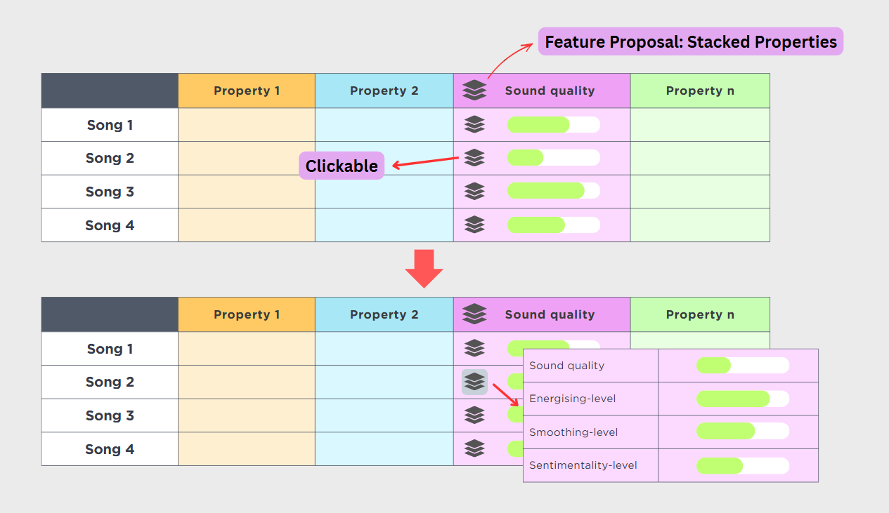
Instead of spreading 5+ rating attributes across separate columns and bloating the Grid, bundle them into a single column.
How it works:
- In the Cell: Displays a primary attribute (e.g., Sound quality) with a clickable Stack icon. Clicking this icon pops up a lightweight card showing all stacked attributes with their full level bars—allowing you to inspect or tweak them instantly without leaving the row.
- In the Header: The column displays the currently active attribute. Clicking the header’s stack icon lets you switch which property is shown on the grid and used for sorting/filtering.
Why this solves your problem:
- Zero Grid Bloat: 5–10 level indicators take up the space of just 1 column.
- Preserves Data Integrity: Unlike the multi-select workaround, every attribute remains a discrete, sortable property behind the scenes.
- No Side Peek Fatigue: You can view and edit all related scores directly in-place with a single click.
That’s a nice idea, @360lime and I appreciate the work that you’ve done for showing us this!
I must say, I’m not convinced for my problem, but the idea is still inspiring in general. 
Why I don’t see it as the solution is this:
- The clickable stack NEEDS to become clicked for each single Object to see its content.
– That’s in principle the same as using the Side Peak Layout and clicking on each single Object.
But I want to have overview over all attributes in the Grid at one glance. - Your idea is nice, to chose the one specific Property out of the stack, that’s at the moment of the greatest interest.
But again, it’s in principle the same as putting the Properties into separate columns and to hide or move the less interesting Properties out of view.
Still wanted is a way to see all five Properties at once on one glance.
I can tell you, I have over 1000 songs in Anytype.
When I gave most of them the mentioned Tags, I needed to scroll through the whole large Grid more then once. It needed time.
But I did mistakes, that forced me to control everything again … and once more … and again …
– I would become crazy if I could see only one attribute at the time!
Even without making errors, I would need to scroll five times through the looong Grid. 
A tipp for newly invited AnyTwo testers:
In my Space, I’ve added “(C)” at the end of each Collection’s name, to better distinguish them from Mini-Apps.
I suppose that Collections are core functions, while Mini-Apps are more likely to vanish over time, or to become heavily modified so that data loss could happen.
At start, your brain will hurt.
There are “People” and “Contact” and “Profile” and “Organisations” in the Space.
As well as “CRM” and “Meetings”.
– I still find it hard to wrap the brain around the differences. The functionalities seem to overlap each other.
Now, if I want to add a Person’s data, I know on the first glance what’s the solid Collection and what’s just a (maybe experimental?) Mini-App that maybe isn’t there anymore tomorrow.
To show you what I mean:
.
Everything that you activate in that Space setting area, appears on the left in the side menu.
If you activate all of that, you have the salad:
“People”, “Contact”, “Profile”, “Organisations” plus “CRM” and “Meetings”.
– Happy birthday!
In my first two days, I used a Mini-App for adding persons’ data, not knowing what’s going on.
Later it became clearer that that was maybe not the best idea.
One of the Mini-Apps is even instabile and causes sync errors.
Therefore: better use collections. But you can’t differentiate them from Mini-apps by looking on them, therefore do something to be able to differentiate – for example the mentioned “(C)” that you also see in the video.
One tipp more:
New space" in the side menu confuses with its name!
Believe it or not:
Only today I got it, that “New space” is only a placeholder name that the user can (and should) edit.
All the time I was confused about that name, because I’ve expected here the functionality that the name implies: to create a new Space! – But exactly that isn’t possible there.
My suggestion for the team:
Rename that thing into “Unnamed Space”.
- This name doesn’t imply a not existing functionality → less confusion for the user!
- And it gives the user the clear hint, that he can and should give it a proper name.
– And the suggestion for new testers is of course, to rename it as you want.
Actually, there is only one Space. Call it for example “My main Space”.
A simple, pragmatic idea just came to mind regarding the long attribute names, @Code-Jack:
Instead of rotating column headers 90 degrees (which bloats vertical height and is hard to read), what if you replace the text headers with single Icons or Emojis?
For your 5 music attributes, you could use intuitive symbols:
 for Sound quality
 for Energising-level
 for Smoothing-level
 for Sentimentality-level
 for Hypnotizing-level
With just an icon in the header and a single number 0–9 in the cells:
- Each column can be shrunk down to just 40–50px width.
- All 5 attributes combined will take only ~200px of horizontal space (easily fitting on any screen without horizontal scrolling).
- You can still see all 5 values simultaneously with zero clicks, scan for errors in seconds, and sort natively by any column.
Sometimes the simplest UI tweaks beat complicated structural features!
Man, you are good!
AnyTwo should be able (I believe, internally it is already the case) to have both: a real name and a name that becomes displayed in the column headers.
For the headers, it displays the symbols. But if the user hovers the mouse above it, it shows the full name as text.
I’ll suggest that to the team, thank you @360lime !
Just to clarify, my original thought was actually much simpler: literally using an icon or emoji directly as the property name—something you can already do right now without needing any new features.
That said, having a real name paired with a display symbol and a hover tooltip is another way to look at it. If you feel that’s necessary for your workflow, feel free to pitch it to the team!
Believe it or not, I already do the thing since long, but in a Views name (not in the column headers though)
– I have a mushroom icon as “name” of one of my Views.
But the problem why this principle wasn’t sufficient also for column headers was the fact, that this icon would be the Properties name then.
But a real (text) name is necessary for the filters and sorts and search and everything.
It was not on all places possible to use an icon as a Properties name. And Razor didn’t do anything against it, so I forgot the idea.
Your post opened my eyes again. And it was clear again, that there must be a real (text) name plus a displayed name (that can be an unicode icon). Both belong together.
The icon is quasi a “Property” of the name itself!
That’s the solution!
I’ve already suggested it, thanks again!
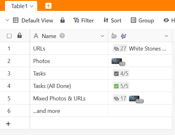
This ties in with a similar request I’ve been making for a long time for Anytype, but which focused on the column content: a “compact mode” display for the columns.
A button for URLs (instead of showing the beginning of the address—“ht” looks ugly and is useless)—and the same for the name (for all those cases where a title isn’t relevant, this lets you keep the subject line open without cluttering it up).
In Anytype, the column title is already reduced to an icon when minimized, which is great.
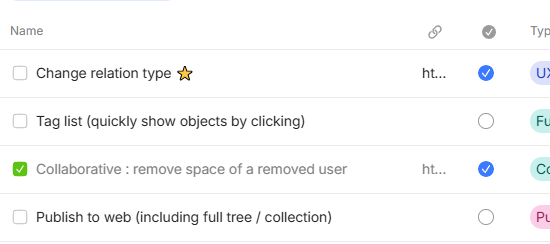
Doing the same in Anytwo, with the option to choose that icon—of course I’m all for it too!
So I am not a tester of Anytwo at the moment, but I would like to request some features I learned to love from my VSCode and would like to see in Editor2.0
@kaye as right now the editor needs are discovered, may this is something that could be added.
Multicursor support
Have the possibility to add multiple cursor on different ways make editing more powerful
Find occurrences
This is like Find/Replace but can be more flexible when it comes to editing
New Line above/below no matter what position
adding a new line above/below the current line prevents the need to go to the start/end of the line
Smart Select of a word
no matter what position you are within a word you can select it
Perhaps what this tells us is that the table component might use the same treatment as editor 2.0 itself.
It’s likely AT2 users will be asking for more and more functionality there, so it may be easiest to source an external component that fits the license and use cases…
The direction AT2 seems to be taking is extensibility-by-user, so that would fit well too.
They’re all good additions, for sure. You can write each of them (individually) in say.any.org and see if others vote for them.
Alright, I’ve done so. I hope it will get some votes, as this but be a fantastic addition to Editor 2.0 in my opinion.
I wonder why all ideas have been posted as Bugs. I am 100% sure I posted it as Feature 
An example, what makes the daily work quicker thanks to AnyTwo:
I believe we all know the situation in Anytype:
Suddenly rolls some bunch of information to us and we need to store it qiuckly, because the next bunch is already on the way.
Problem with that new information: it seems not to fit in our established data management concept.
This is what runs in our brain in that moment:
- There is no good Collection for it yet, time is short, what should I do?
- And what Type should I use?
- Do I have a Template for that kind of information?
- I’m too tired at the moment to think about all such details, but I need to store that information quickly, there comes more after that …
OK, that above was for Anytype.
How is it in AnyTwo?
– It doesn’t matter so much!
Simply put the incoming information in one or some new Object(s).
- You don’t need to think about the Type
- You don’t need to think about a Template
- You don’t need to think about the Collection
If a second bunch of information comes, do the same: put it in Objects. Nothing matters yet.
No need to be afraid that you lose the track, it will not happen.
Later, if you have more time, you are able (and you should) add the correct Collections to the individual Objects.
This process, even for dozens of Objects, is quick and easy.
You could for example go to the “Page” Collection (it’s a “Mini App” to be precise) where they automatically appear, and use the fantastic Side Peak Layout.
That gives you a quick way to do some modifications in a whole bunch of messy Objects.
After assigning the right Collections to each Object, they appear where you wanted them to appear. And you have never spent a single thought about “which Type should I use?”. But all the headers, with the needed Properties are there, waiting for your inputs.
– There is nothing substantial new here in this post, but I wanted to make it much more clear why the new features make everything more fluid in real practice, even under pressure when time is short.
Think on this situation (you may know it):
You’ve convinced a friend to try Anytype (the old one). You even visit him, for a first introduction on his own computer.
He wants to see something … but wat: first we need to configure Types, maybe also Templates, and a Collection and a Query …
Also this and that doesn’t work yet, because we first need to …
:-/
This has become sooo much better!
It still needs time to configure a working system that fits to the own needs.
But now its more this way:
Put all your dammed information into it, don’t care about details, do the boring things later!
Would be great if someone could share some collaboration functionality impressions. It’s good that many personal knowledge db scenarios are working, they are the backbone of a good notion alternative, but there are many other tools like Obsidian that can already do that well.
The core differentiation of Anytype, especially for business customers, is collaboration, chat and integration into other systems, what is your impression on that?