Actually, while I see occasional requests for font and color choices, I’m a huge fan of Anytype’s current restrictions here. Biggest reason: I’ve been using Evernote for 10 years and whenever you copy & paste some text into Evernote, either all the formatting is coming over into your note, or nothing. In contrast, thanks to Anytype’s restrictions, just the important formatting lands in my note: headlines, underline, bold, italics and very few others (same as e.g. with Apple Notes). This rigor also avoids tendencies to procrastinate over formatting my texts (“hmm, maybe another font would be nicer…”) rather than refining what I want to say.
However, having said this, I do want to be able to tweak Anytype’s general appearance a little bit, as many others expressed it already. Individual preferences about this may vary, obviously. I presume the best way to approach this would indeed be a user-friendly way to Customize Anytype’s general CSS, as suggested e.g. by this feature request.
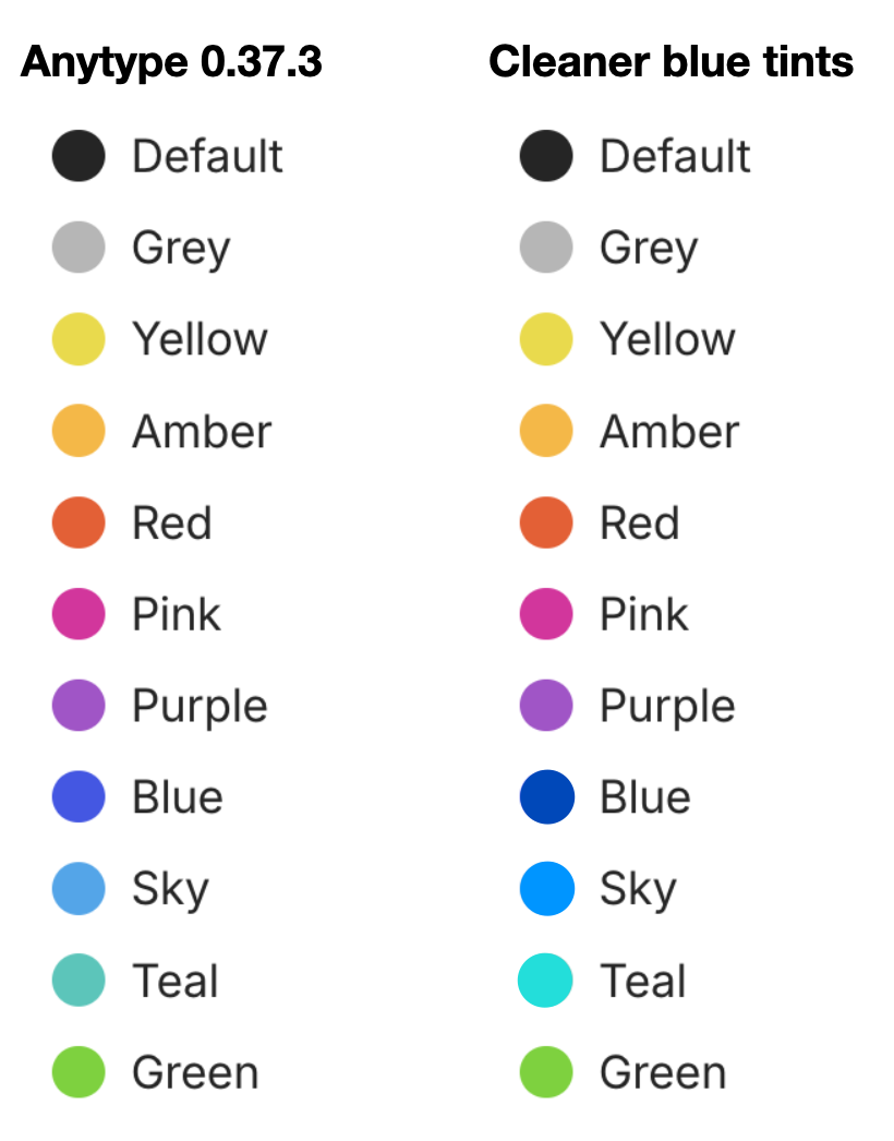
In my particular case, while I’m a huge fan of Anytype’s overall appearance (IMHO Anytype looks just amazing!), I don’t understand Anytypes particular CSS choices for the blue, sky and teal palette colors. I believe they don’t match the other (beautiful) colors they’ve chosen, and I’d love to be able to tweak them a bit, to be clearer, purer and a bit more vivid, in ways that work in both bright and dark mode.
This is now obviously my personal choice, and I don’t intend to push it onto anyone else. But I’m sure, having a choice while maintaining the overall list of colors (yellow, amber, red, …) would be good.