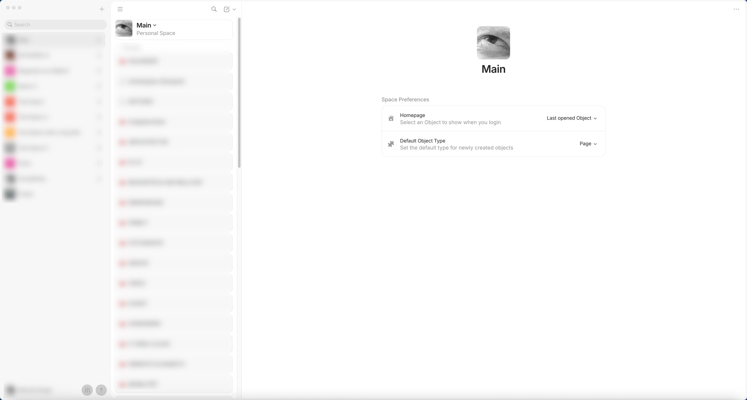
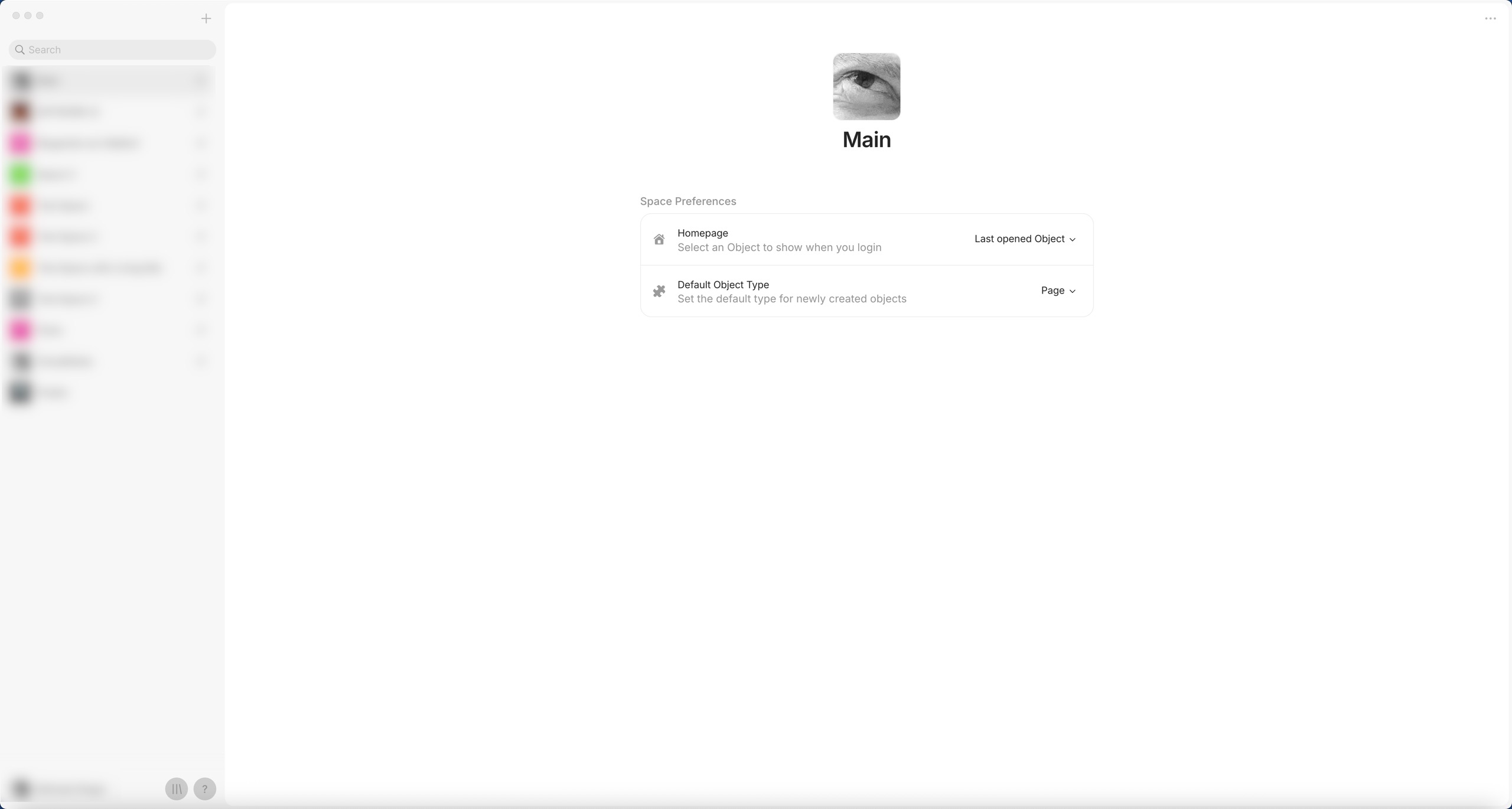
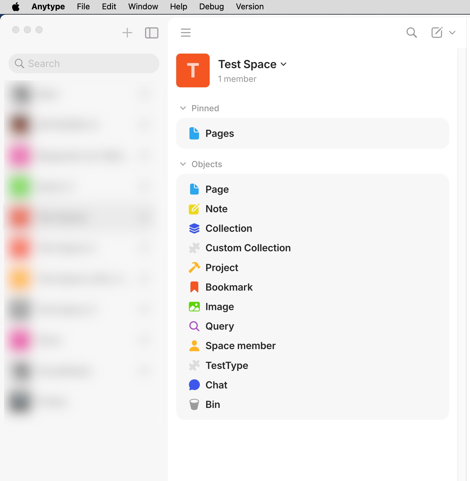
Miraculously, the button for the sidebar widgets has reappeared. Sorry, but the screenshot above is real. It must have been a local problem. Or it has to do with this still unsolved problem:
However, there is no button for the spaces sidebar to close it. Is it actually intentional that the spaces sidebar should be closed using the handles for the width adjustment?
Yeah, since it’s the same action our design team has removed the button in mac. I do not get why you have this problem with the Page type, I have removed the code that could cause this behaviour, but seems it’s some different problem.
Hm… this is really bad design in my opinion. If there is a button to open a sidebar, there must also be a button to close it.
It is incomprehensible that the same principle - opening/closing - has to be carried out in two completely different ways (and in such a fiddly way as searching for the handle with the mouse cursor on the edge of the sidebar). This is completely counterintuitive.
Thanks for your feedback. We’re still testing the new sidebars and navigation UX, so you can expect some changes soon.
We understand that keeping both sidebar icons always visible might seem like an obvious choice. However, now that we have two sidebars, having both icons permanently visible can feel visually heavy and confusing. The idea behind the change was that the Widgets sidebar is meant for frequent interaction - something users open and close often, especially when it comes to chats - while the Spaces (Channels) sidebar serves as a more permanent navigation element.
We’re also planning to introduce a compact mode, similar to the previous narrow strip version, which should make it even less necessary to open and close the sidebar frequently. Also you can hover near the sidebar edge to reveal a control that lets you close it with a single click.
Thank you for your answer @yura, very much appreciated!
That’s promising, thanks for the info!
Sorry, but I completely disagree. This is exclusively about usability, about the app functioning in everyday use, not about an assumed visual overload.
Overload is not an issue here, redundancy would be. But this is simply about the disappearance of an action button after an action.
If you provide a button to open something, then you also have to provide a button to close it. That is the user’s intuitive expectation.
It’s like a switch for a rarely used light source disappearing when the light is on. At some point, you want to turn off the light and look for the switch.
That’s nice because it would take up the least space even on small screens and would always be accessible. Of course, that means there’s no room for that search bar at the top, but who needs that search function when it’s not even clear what it’s supposed to be used for?
In my opinion, this “search” at the top of the spaces sidebar is pretty pointless anyway, because you can only search for the names of existing spaces. You would have to have dozens of spaces to need a search for them, which is pretty unrealistic.
I think there is nothing visually heavy and confusing:
Sorry, but for me, this is the most counterintuitive way to close a sidebar. Who would think to click on a resize handle that appears when you hover over it with the mouse to trigger an action like closing the sidebar?
It may be nice as an alternative, but that’s not what the user expects in the first place.